

Caesura Concept
Adobe Photoshop, InDesign, 6” x 9”
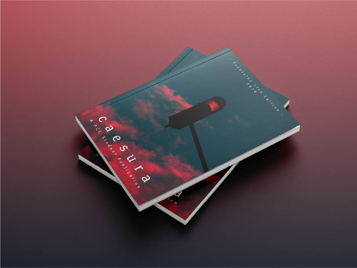
Caesura is a book design project I did my Junior year at school. Every year, in the publication design, students team up and get to compete for the privilege of designing that year’s student publication: Fountains. Fountains contains student writers’ fiction and non-fiction short stories and poetry. While my design didn’t win, I am still extremely proud of my work.
The theme of Fountains 2026 was Caesura– a break or pause in poetry or musical composition. The overall goal of the book was to make people stop and think, and I created my design to evoke a like image. I used mostly moody colors and stoplight imagery to communicate this idea.
In the Image of God
Adobe Indesign, Illustrator, 5.5” x 8.5”
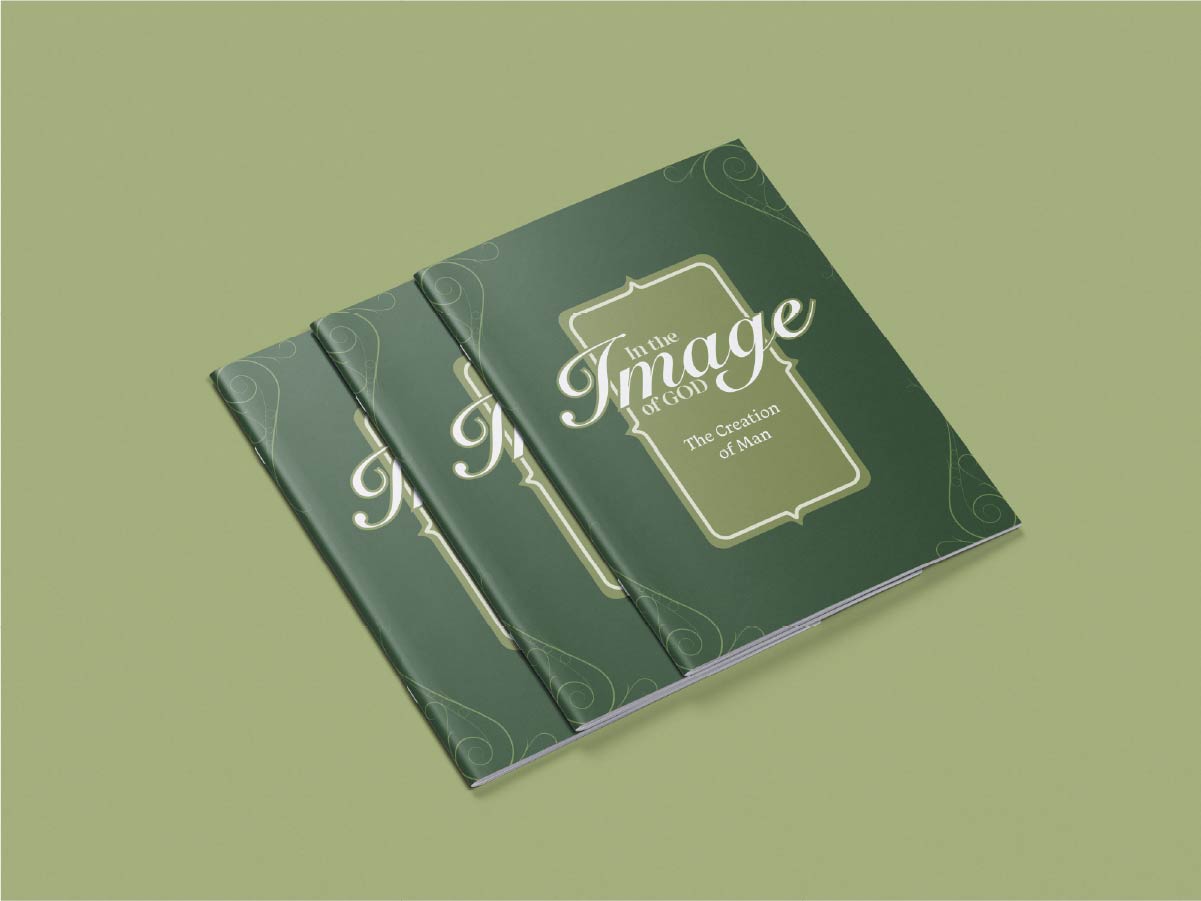
In the Image of God is a booklet project targeting young men, to teach them about the creation and the worth of man in God’s eyes. My inspiration for this project was primarily Lord of the Rings-style elven architecture and design, because, for me, that's what reminds me of the garden of Eden, an important location in the story of the creation of man. I used a mix of greens because it is reminiscent of plants, growth, and creation, and because it is a relaxing, confirming color. The end product is something that accomplishes its mission with a design that matches the written content.
City Guide: Nashville, TN
Adobe Photoshop, InDesign, 5.5” x 8.5”
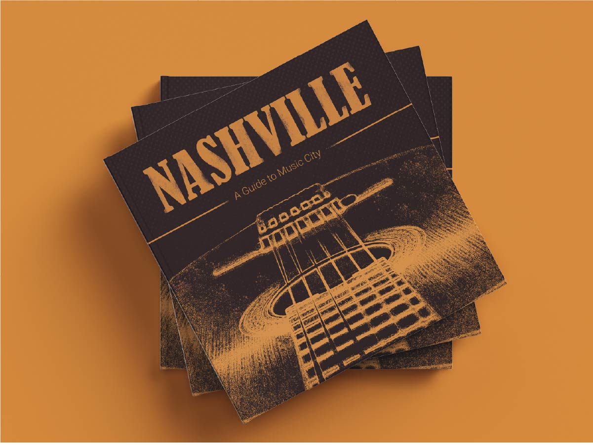
The city guide was a collaborative project aiming to create a book highlighting important aspects of the culture, infrastructure, etc. of a certain city. My group chose Nashville, Tennessee. Nashville is known as “Music City,” so we leaned into that when designing the book. We went with a more rugged design with many distressed elements, and we used images color graded to fit the palette we chose, which consisted of deep browns, bright oranges, and desaturated golds. Everything fit together well to match the country music vibe that is so prevalent in Nashville.
Icarus Rising
Adobe Photoshop, InDesign, 6” x 9”
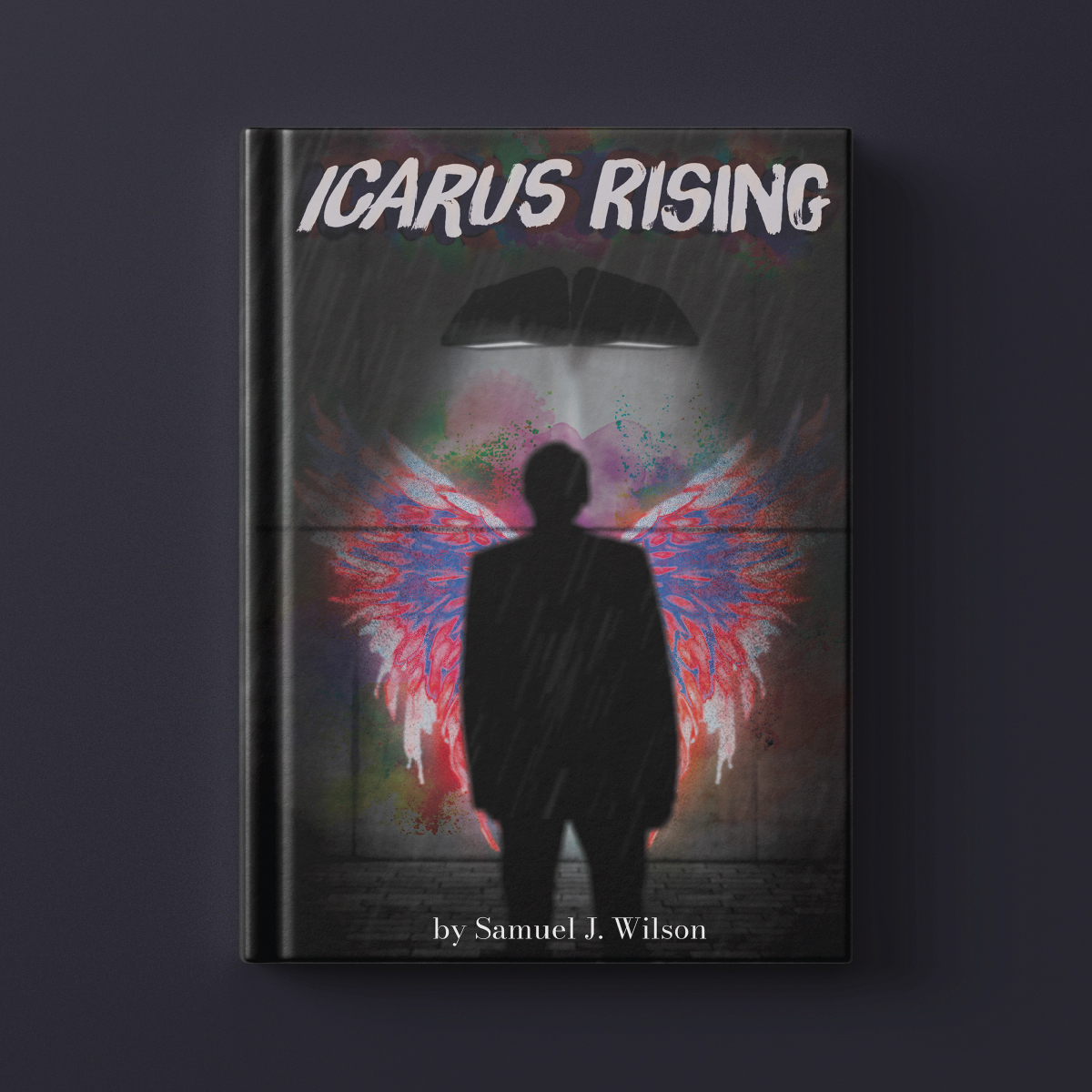
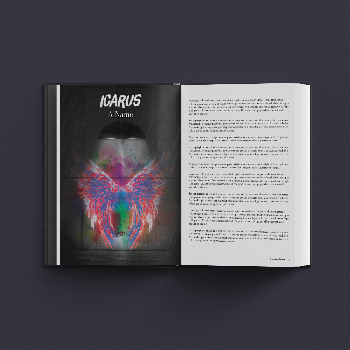
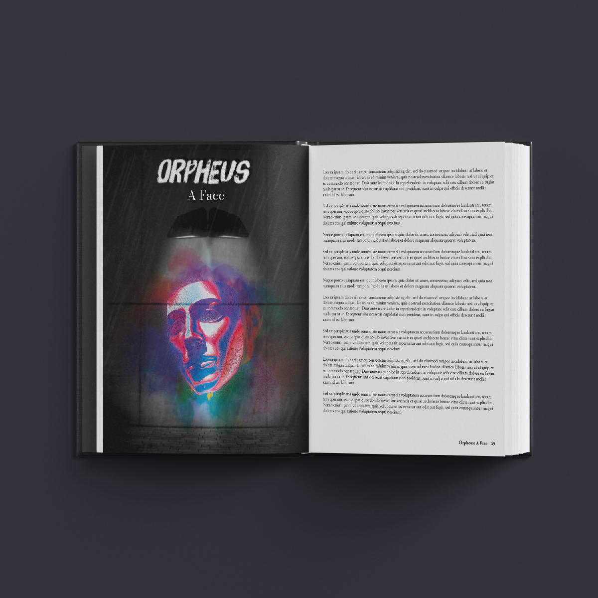
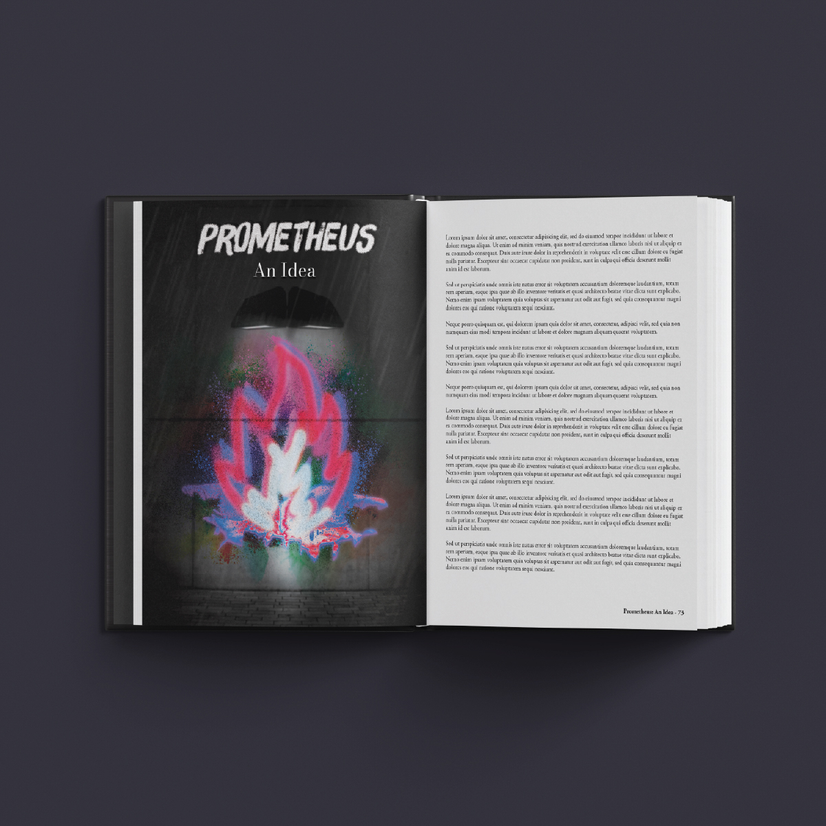
Icarus Rising is a professional writing portfolio by Samuel J. Wilson. It explores humanity, specifically how we as humans sees each other as well as themselves, and how humanity can have hope in God. It asks the questions “What defines humanity?” and “What makes me human?” I had the privilege of working alongside Samuel to design the cover and certain interior pages.
Overall, the design leans heavily on the contrast of color in a black and white world, with the color symbolizing our humanity. It evokes and calls back to the idea of questioning what it is that makes us human.
Beyond Beautiful Playing Cards
Adobe Illustrator, 3.5” x 2.5”
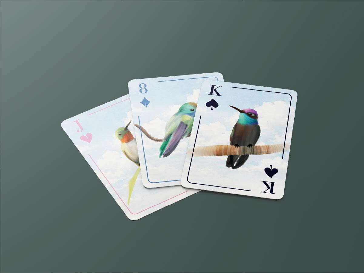
Beyond Beautiful is a glass hummingbird feeder brand that I did some work for while interning at BestNest Inc. during summer 2026. They commissioned our marketing team, asking for a deck of branded playing cards. This project was assigned to me, and I spent some time both learning the brand and learning how to make good playing cards. My first concept was to design the cards to look like stained glass. It was a good concept, but we felt it wasn’t quite right. The branding consists largely of watercolor-style assets, so I went with that direction instead. After some more communication with the client and revisions, I ended up with something we all really liked.
City Guide: Nashville, TN
Adobe Photoshop, InDesign, 5.5” x 8.5”
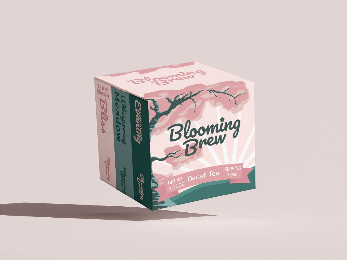
Blooming Brew is a brand I created for a package design project. The goal was to create a package for a tea company that values the simpler things in life: relaxation and nature. I took inspiration from the cherry blossom tree to communicate this, as I’ve always viewed it as a beautiful feature of God’s creation that helps me relax. I also named each tea flavor in this sampler package after this relaxing, nature-themed concept to help keep the whole idea consistent and unified. The branding is very illustrative to match competitors in the tea/coffee market, and the colors are almost pastel pink and green tones to achieve a complimentary and relaxing palette.